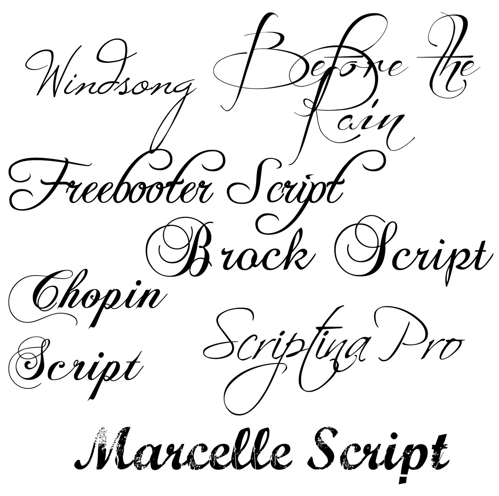
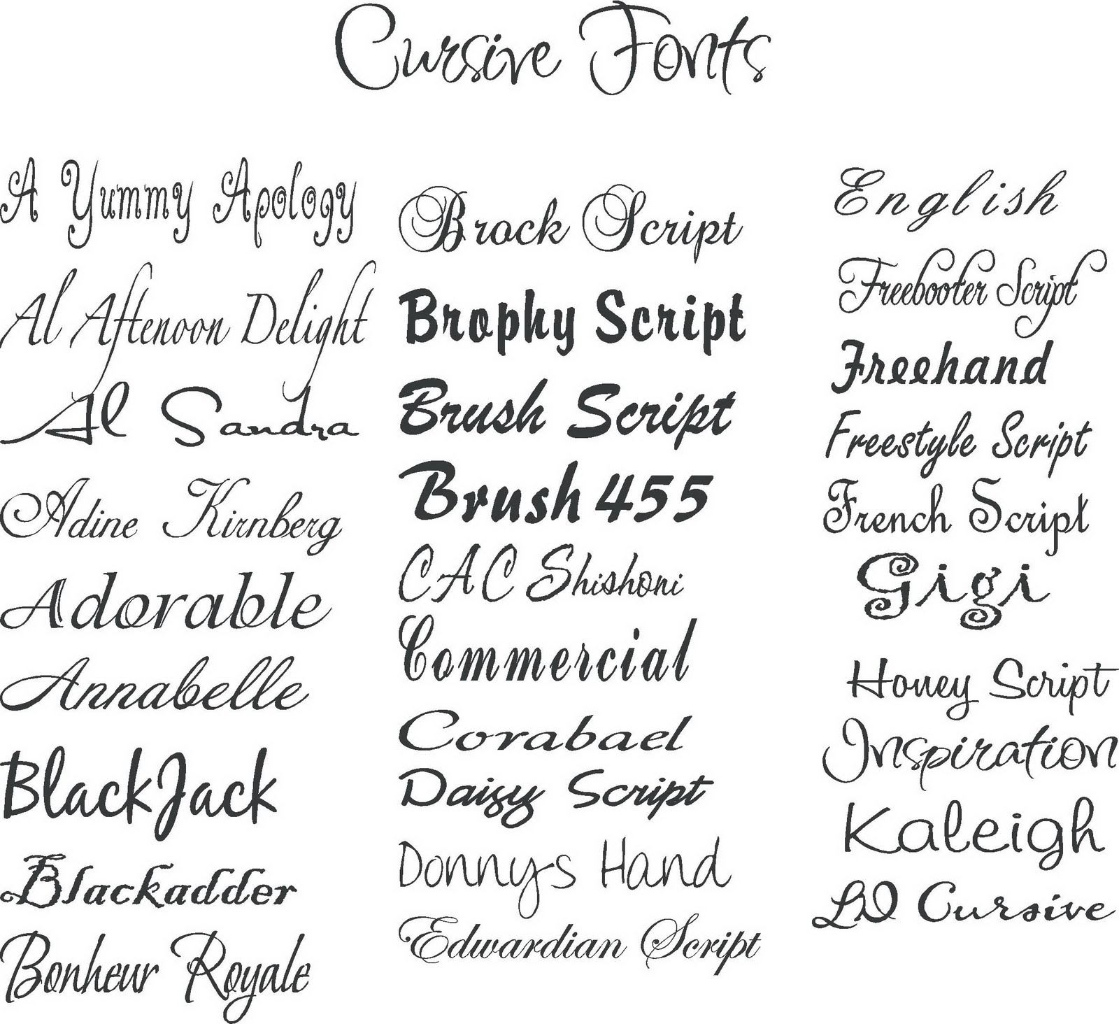
Unlocking the Power of Modern Font Choices: A Guide to Typography
In the digital age, where content reigns supreme, the way we present information is just as crucial as the information itself. Typography, the art and technique of arranging type, plays a pivotal role in communication. Selecting the right font can transform a mundane message into a captivating experience. This exploration into the realm of modern fonts will illuminate their importance, unveil popular choices, and guide you towards making impactful typographic decisions.
Imagine encountering a website with an unreadable, outdated font. Chances are, you'd quickly leave. Conversely, a website with a clean, modern font invites you to explore, engaging you with its visual appeal. This illustrates the power of font selection in shaping user experience. The seemingly simple choice of typeface can significantly influence how your message is perceived, affecting readability, brand identity, and overall aesthetic appeal.
Modern fonts, characterized by their clean lines, geometric shapes, and overall contemporary feel, have become a staple in digital design. They offer a fresh, forward-thinking aesthetic that resonates with today's audiences. From sleek sans-serif fonts like Montserrat and Open Sans to elegant serif fonts like Playfair Display and Lora, the variety available allows designers to find the perfect match for any project.
Understanding the history of fonts is essential for appreciating their evolution and the nuances of their design. From the earliest forms of writing to the digital typefaces we use today, fonts have constantly adapted to changing technologies and aesthetic preferences. The rise of digital typography has opened up a world of possibilities, allowing for greater experimentation and customization.
Beyond mere aesthetics, font choice plays a critical role in accessibility. Selecting fonts that are easy to read, especially for individuals with visual impairments, is paramount. Factors like font size, weight, and spacing all contribute to readability. Responsible font selection ensures that your message reaches the widest possible audience, promoting inclusivity and effective communication.
The origin of modern fonts can be traced back to the modernist movement of the early 20th century. This era saw a shift towards simpler, more geometric forms in art and design, which influenced the development of typefaces like Futura and Helvetica. These fonts became synonymous with modernism and continue to be widely used today.
Choosing appropriate font pairings can elevate your designs. Combining a serif header font with a sans-serif body font creates a balanced and visually appealing hierarchy. Examples of harmonious pairings include Playfair Display with Open Sans, or Montserrat with Lora. Experimentation is key to finding combinations that work for your specific project.
Benefits of using modern fonts:
1. Enhanced Readability: Many modern fonts prioritize clarity and legibility, making them ideal for websites, articles, and other text-heavy content. Example: Open Sans
2. Strong Brand Identity: Carefully chosen fonts can reinforce your brand's personality and create a cohesive visual identity. Example: Using a bold, geometric font for a tech company.
3. Improved User Experience: A well-chosen font can enhance the overall user experience by making content more accessible and engaging. Example: Using a playful font for a children's website.
Best Practices:
1. Limit Font Choices: Stick to a maximum of two or three fonts for a clean and cohesive look.
2. Consider Context: Choose fonts that align with the tone and purpose of your project.
3. Prioritize Readability: Ensure your chosen fonts are easy to read across different devices and screen sizes.
4. Test Your Fonts: Experiment with different font combinations and sizes to find what works best.
5. Optimize for Web Performance: Use web-safe fonts or optimize font files to minimize loading times.
Examples of Modern Fonts:
1. Roboto: A versatile sans-serif font widely used in Android operating systems and web design.
2. Lato: A clean and professional sans-serif font suitable for both headings and body text.
3. Poppins: A geometric sans-serif font with a modern and playful feel.
4. Oswald: A condensed sans-serif font ideal for headlines and titles.
5. Raleway: An elegant sans-serif font with a wide range of weights.
Advantages and Disadvantages of Modern Fonts
| Advantages | Disadvantages |
|---|---|
| Clean and contemporary aesthetic | Can feel impersonal or sterile in some contexts |
| Excellent readability on screens | Overuse of certain popular fonts can lead to a lack of originality |
| Wide variety of styles available | May not be suitable for all project types (e.g., historical documents) |
Frequently Asked Questions:
1. What is a serif font? - A serif font has small decorative strokes at the ends of letters.
2. What is a sans-serif font? - A sans-serif font lacks the decorative strokes of a serif font.
3. Where can I find free fonts? - Websites like Google Fonts offer a vast library of free fonts.
4. How do I choose the right font for my website? - Consider your brand identity, target audience, and the overall tone of your website.
5. How many fonts should I use on my website? - It's generally recommended to stick to two or three fonts for optimal readability.
6. What is font pairing? - Font pairing is the art of combining different fonts harmoniously.
7. What are web-safe fonts? - Web-safe fonts are fonts that are pre-installed on most operating systems, ensuring consistent display across different devices.
8. How can I optimize font performance on my website? - Minimize the number of font files used and optimize their file sizes.
In conclusion, selecting the appropriate font is a crucial element of effective communication in the digital realm. Modern fonts, with their diverse range of styles and inherent readability, offer a powerful tool for enhancing user experience and conveying brand identity. By understanding the principles of typography and considering factors like readability, accessibility, and brand alignment, you can harness the power of font names and examples of modern fonts to create visually appealing and impactful designs that resonate with your target audience. Take the time to explore the vast landscape of modern typography, experiment with different font combinations, and discover the transformative effect that the right font choice can have on your communication. Start exploring today and elevate your design to the next level.
St michael tattoo meaning designs divine inspiration
Cracking the code california dmv test answers
Unpacking the chevy 53l engine power performance and potential

Sign Fonts Writing at Leonardo Cook blog | Innovate Stamford Now

font names and examples of modern fonts | Innovate Stamford Now

font names and examples of modern fonts | Innovate Stamford Now

Cool Font Examples at James Mcelroy blog | Innovate Stamford Now

font names and examples of modern fonts | Innovate Stamford Now

Best Fonts For Name Signs at Serena Heasley blog | Innovate Stamford Now

45 Best Canva Font Pairings | Innovate Stamford Now

The Best Aesthetic Canva Fonts for Your Brand | Innovate Stamford Now

What Is The Best Font For Business Proposals at Elba Ibarra blog | Innovate Stamford Now

List Written In Cursive | Innovate Stamford Now
Free Font Collection 18 Modern Fonts | Innovate Stamford Now

Free Font Collection 18 Modern Fonts | Innovate Stamford Now

Font names and examples | Innovate Stamford Now

font names and examples of modern fonts | Innovate Stamford Now

The Best Free Retro Fonts on Canva | Innovate Stamford Now